Halo-Lit vs Front-Lit Channel Letters: Which Style Fits Your Brand?
If you've decided your storefront is getting channel letter signs, the next decision is illumination style. Channel letters can be illuminated four different ways, and each looks dramatically different at night. The two most common — and the two most often compared — are front-lit and halo-lit. They're built differently, they cost differently, and they create completely different impressions when illuminated.
This guide walks through what each style actually is, how the visual differs, where each one belongs, and how to decide which fits your specific storefront and brand position.
Front-lit channel letters have translucent acrylic faces that glow. Halo-lit channel letters have solid metal faces with LEDs behind that cast a glow on the wall. Key differences:
- Visual feel: Front-lit reads bold & commercial · Halo-lit reads premium & architectural
- Relative cost: Halo-lit costs 20-35% more than front-lit
- Daytime look: Front-lit shows colored acrylic · Halo-lit shows solid metal
- Best for: Front-lit → high-visibility commercial · Halo-lit → premium retail & corporate
- Lifespan: Both 15-20 years with quality LED components
- Mounting: Front-lit flush mount · Halo-lit standoff mount required
What is a front-lit channel letter?
A front-lit channel letter has a translucent acrylic face that glows when the internal LEDs illuminate it. The structure of the letter is metal (aluminum) on the back and sides — called the "returns" — with colored translucent acrylic on the front. When unlit during the day, you see the colored acrylic face and the metal returns. When lit at night, the face glows in the brand color.
Front-lit is the most common style in US storefront signage. The vast majority of commercial channel letter signs use front-lit illumination — restaurants, retail chains, professional services, banks, hotels. If you're driving past commercial corridors at night and seeing illuminated business names where the letters themselves glow, you're looking at front-lit channel letters.
The face material is typically .150-inch acrylic in a brand-specific color. LED modules sit inside the letter and shine outward through the face. A trim cap connects the face edge to the return edge and is usually colored to match the brand.
Front-lit channel letters work in any retail context, but they read most strongly from distance. If your storefront sits back from the road or your customers approach from highway frontage, front-lit is almost always the right call — the glowing face carries visibility farther than a halo silhouette.
What is a halo-lit channel letter?
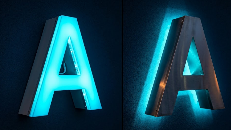
A halo-lit channel letter (also called "reverse-lit" or "backlit") is structurally different from front-lit. The letter face is solid metal, not translucent. The LED modules are positioned on the back of the letter, facing the wall. When illuminated at night, the LEDs cast a glow onto the wall behind the letter — creating a halo of light surrounding the letter's silhouette.
The letter itself reads as a dark silhouette during the day (solid metal face) and at night (the face is not illuminated; only the wall behind it glows). The visual effect is dramatically different from front-lit: subtle, premium, architectural, with a kind of floating-letter quality that front-lit cannot replicate.
Halo-lit is the choice for premium retail, corporate headquarters, luxury hotels, professional services, museums, and any building where the storefront wants to read as architecturally integrated rather than commercially announcing itself.
Side-by-side comparison
The two illumination styles differ across nearly every dimension that matters in a sign decision. Here is how they line up at a glance.
| Factor | Front-Lit | Halo-Lit |
|---|---|---|
| Face material | Translucent acrylic | Solid metal (aluminum, brass, bronze) |
| Illumination direction | Forward (face glows) | Rearward (wall behind letter glows) |
| Visual feel | Bold, commercial, contemporary | Premium, architectural, sophisticated |
| Daytime appearance | Colored acrylic visible | Solid metal letter shape |
| Relative cost | Baseline | +20% to +35% |
| Mounting | Flush against wall | Standoff hardware required |
| Wall surface dependency | Any surface | Light-colored backer ideal |
| Visibility from distance | Stronger (face glow visible far) | Weaker (halo reads close-up) |
| Best fit | QSR, retail chains, gas stations | Luxury retail, fine dining, corporate |
The visual difference at night
This is the difference most buyers feel most strongly. Front-lit and halo-lit don't just light up the same letters differently — they create completely different impressions.
Front-lit at night: You see the letters themselves glowing in their brand color. The sign reads as bold, visible from distance, commercially identifying. This is the look of "open business, here we are." High-impact, high-visibility, easy to read.
Halo-lit at night: You see the dark silhouette of each letter against a glow on the wall behind it. The sign reads as architectural, premium, sophisticated. This is the look of "established brand, no need to shout." Lower-impact in pure visibility terms but higher-impact in perceived brand quality.
During the day, the difference is also significant. Front-lit letters show their colored acrylic faces — they read as branded immediately. Halo-lit letters show as solid metal, which can be brushed aluminum, polished aluminum, painted, anodized in any color, or a premium metal like brass or bronze. Halo-lit letters have a more refined unlit appearance because the daytime view is the metal letter itself rather than colored plastic.
The cost differential
Halo-lit channel letters cost more than front-lit channel letters of the same size. The premium is typically 20 to 35 percent. Four factors drive that gap:
- Metal-face fabrication: Solid metal letter faces require more precise fabrication than acrylic faces. Edge finishing, polishing, and surface treatment add labor.
- Mounting hardware: Halo-lit letters mount with standoff hardware that creates the gap between the letter and the wall for the halo effect. Front-lit letters mount flush. The standoff hardware adds material and labor.
- Wall surface preparation: The halo effect depends on the wall behind the letter being light enough to reflect the LED glow. Dark or busy wall surfaces sometimes require repainting or installing a backer panel. Front-lit letters work against any wall surface because the letter itself glows.
- LED density: Halo-lit letters require LEDs facing the wall at consistent density to create an even halo. Front-lit letters can use slightly fewer LEDs because the acrylic face diffuses light naturally.
For a typical 18-inch tall channel letter set spanning 12 to 15 feet of storefront, the halo-lit premium is real but rarely prohibitive. Most buyers who choose halo-lit do so for the visual impact rather than working around the cost.
The cost premium on halo-lit letters scales with letter size. On small letters (under 12 inches) the difference is modest. On large letters (36 inches and up) the standoff mounting hardware and metal-face fabrication can push the gap closer to the upper end of the 20-35% range.
Where halo-lit makes sense
Halo-lit channel letters are the right choice for businesses where premium brand positioning matters more than maximum visibility:
- Premium retail (luxury fashion, high-end home goods, jewelry, watches)
- Fine dining and chef-driven restaurants
- Corporate headquarters and Class A office building entries
- Law firms, accounting firms, financial services, wealth management
- Boutique hotels and resort properties
- Museums, galleries, and cultural institutions
- Medical specialty practices (plastic surgery, dental, cosmetic dermatology)
- Any building in a historic district where architectural integration matters
- Multi-tenant retail properties where the building owner wants premium tenant signage
The pattern: halo-lit signals "established premium." If your brand is premium-positioned, your storefront should look premium-positioned, and halo-lit channel letters are how that gets communicated visually. Premium markets like the Bay Area, New York, Miami, and Los Angeles see particularly heavy halo-lit usage on flagship retail.
Where front-lit makes sense
Front-lit channel letters are the right choice for businesses where readability from distance and commercial identification matter most:
- Quick-service restaurants and casual dining
- Standard retail and chain stores
- Auto repair, dry cleaners, salons, and similar service businesses
- Gas stations and convenience stores
- Strip mall tenant signage
- Any business where high-visibility commercial identification is the primary goal
- Properties on major arterials where readability from distance matters more than aesthetic refinement
- National brand mandate signage following corporate brand standards
The pattern: front-lit signals "open business, find us." If your brand needs to be seen from distance, read fast, and communicate commercial intent immediately, front-lit channel letters do that job better than halo-lit. Markets dominated by high-volume commercial signage — Houston, Dallas, Phoenix, Atlanta — use front-lit for the vast majority of installations.
Match the sign to the building, not against it. A halo-lit sign on a basic stucco strip-mall facade looks over-engineered. A front-lit sign on a stone or brick premium retail facade looks under-engineered. The architecture sets the expectation; the signage should meet it.
The combination option
The two illumination styles aren't mutually exclusive. Combination channel letter sets use both front-lit and halo-lit illumination on the same sign — typically with the main brand name halo-lit and a secondary tagline or icon front-lit, or with one color of letters front-lit and another halo-lit. This creates a layered effect more visually rich than either single style.
Combination sets cost more than either single style alone (you're paying for both fabrication approaches), but they can be visually striking for premium properties wanting maximum architectural impact. National retailers and major hospitality brands occasionally specify combination sets for flagship locations.
What about open-face?
The third channel letter illumination style is open-face — the letter has no face material at all, exposing the LED modules inside the letter return. This creates a vintage, lit-from-within look that's neither halo-lit nor front-lit. Open-face is a specialty style typically used for entertainment venues, music halls, craft breweries, and businesses going for an intentionally retro aesthetic. It's not a mainstream commercial choice and isn't usually compared directly to halo-lit or front-lit in standard buying decisions.
For multi-location brands, lock the illumination style at the brand-standards stage and apply consistently across all stores. Mixing front-lit and halo-lit across locations creates visual inconsistency that erodes brand recognition. See our guide on multi-location brand rollouts.
How to decide
Two practical questions resolve this for most buyers.
Question 1: What does the rest of your storefront look like?
If your building is architecturally premium — stone facade, contemporary design, integrated landscaping, premium materials — halo-lit letters complete the look. If your building is a standard commercial structure — stucco, brick veneer, conventional storefront glazing — halo-lit letters can look over-engineered against the building. Match the sign to the building, not against it.
Question 2: What's your competition doing?
Drive past your direct competitors in your market. If they're all front-lit, halo-lit is a premium differentiator that elevates you above them. If they're already halo-lit, you need to match or exceed that standard to avoid looking like the budget option. Local norms matter, and matching or beating the local norm is usually the right call.
The bottom line
Front-lit channel letters are the bread and butter of US storefront signage. They work, they're cost-effective, and they do exactly what you want a commercial sign to do — identify your business and read clearly from distance.
Halo-lit channel letters are the premium upgrade. They communicate brand quality through architectural refinement. They cost meaningfully more. They look meaningfully better in the right context. They're worth the premium when brand positioning and storefront context justify the cost.
Neither is wrong. The right answer depends on your brand position, your building context, and your competitive landscape. Most businesses are well-served by front-lit. Some businesses are better served by spending the premium on halo-lit because their brand calls for it.
Rendered design concepts for your storefront
Request a free quote and we'll send rendered design concepts showing both front-lit AND halo-lit options on your actual building photo. See exactly what each style looks like in your specific context before committing.
Frequently Asked Questions
What is the difference between halo-lit and front-lit channel letters?
Are halo-lit channel letters worth the extra cost?
What factors affect the cost difference between halo-lit and front-lit?
Which lasts longer — halo-lit or front-lit channel letters?
Can I combine halo-lit and front-lit on the same sign?
What's the best illumination style for premium retail?
What's the best illumination style for high-visibility commercial?
Do halo-lit and front-lit channel letters require different permits?
What's the difference between halo-lit and open-face channel letters?
Can I retrofit existing front-lit letters to halo-lit?
American LED Signage is part of a network of commercial lighting and signage specialists. For projects beyond storefront signage, see our partner sites: Dallas LED lighting services, Fort Worth LED lighting, Arlington LED specialists, Plano commercial LED, statewide Texas LED lighting, American Starlight Ceilings for premium fiber optic ceilings, fiber optic lighting systems, pool and aquatic LED lighting, wholesale LED components, and modular building solutions.